
|
|

Заголовки
Чтобы создать заголовок, поместите "hn. " в начале строки (где n может быть числом между 1-6)
| Примечание |
Комментарий |
| h1. Самый большой заголовок |
Самый большой заголовок
|
| h2. Больший заголовок |
Больший заголовок
|
| h3. Большой заголовок |
Большой заголовок
|
| h4. Нормальный Заголовок |
Нормальный Заголовок
|
| h5. Маленький заголовок |
Маленький заголовок
|
| h6. Наименьший Заголовок |
Наименьший Заголовок
|
Текстовые эффекты
Эффекты, используемые при форматировании слов и предложений.
| Примечание |
Комментарий |
| *жирный* |
Делает текст жирным.
|
| _курсив_ |
Делает текст курсивом.
|
| ??цитата?? |
Преобразует текст в цитату.
|
| -перечеркнутый- |
Делает текст перечеркнутым.
|
| +подчеркнутый+ |
Делает текст подчеркнутым.
|
| ^надстрочный^ |
Переводит текст внадстрочный.
|
| ~подстрочный~ |
Переводит текст вподстрочный .
|
| {{моноширинный}} |
Делает текст моноширинным.
|
| bq. Некоторый блок выделенного текста |
Чтобы превратить весь параграф в цитату блока, поместите "bq. " перед ним
Пример:
Некоторый блок выделенного текста
|
{quote}
это цитата
содержание будет про цитировано
{quote}
|
Процитировать блок текста длиннее чем один параграф.
Например: выделенное здесь
будет процитировано
|
{color:red}
Ой, мама, глядите, красный текст!
{color}
|
Изменяет цвет блока текста.
Пример:
Ой, мама, глядите, красный текст!
|
Разрывы текста
В большинстве случаев, явные перерывы параграфа не требуются - Confluence в состоянии пронумеровать страницы ваших параграфов должным образом
| Примечание |
Комментарий |
| (пустая линия) |
Создает новый параграф |
| \\ |
Создает перерыв строки. Не часто необходимый, в большинстве случаев Confluence соответственно создаст новые строки |
| ---- |
создает горизонтальную линию |
| --- |
Создает — символ. |
| -- |
Создает – символ. |
Ссылки
Ссылки - сердце Confluence, очень важно знать как их быстро создать.
| Примечание |
Комментарий |
[#anchor]
[^attachment.ext]
or
[pagetitle]
[pagetitle#anchor]
[pagetitle^attachment.ext]
or
[spacekey:pagetitle]
[spacekey:pagetitle#anchor]
[spacekey:pagetitle^attachment.ext]
|
Создает внутреннюю гиперссылку к указанной странице в желаемом пространстве (или текущем, если Вы не определили никакого другого пространства). Добавив дополнительный признак #, сопровождаемый именем якоря, ссылка приведет в определенный отмеченный пункт желаемой страницы. Также следующее за дополнительным ^ название приложения приведет к ссылке на вложения желаемой страницы.
Пример:
заголовок страницы
Если такая страница не существует, то это позволит Вам создать страницу в текущем пространстве. Создать ссылки страницы можно  после этого. после этого.
Пример:
новая страница
|
[link alias|#anchor|link tip]
[link alias|^attachment.ext|link tip]
or
[link alias|pagetitle|link tip]
[link alias|pagetitle#anchor|link tip]
[link alias|pagetitle^attachment.ext|link tip]
or
[link alias|spacekey:pagetitle|link tip]
[link alias|spacekey:pagetitle#anchor|link tip]
[link alias|spacekey:pagetitle^attachment.ext|link tip]
|
Создает внутреннюю гиперссылку к указанной странице в выбранном пространстве (или текущем, если Вы не определили никакого другого), где текст ссылки отличается от фактической связи гиперссылки. Также Вы можете иметь дополнительную подсказку ссылки, которая будет отображаться как всплывающая подсказка. Добавив дополнительный признак #, сопровождаемый именем якоря, ссылка приведет в определенный отмеченный пункт желаемой страницы. Также следующее за дополнительным ^ название приложения приведет к ссылке на вложения желаемой страницы.
Пример:
псевдоним ссылки
|
|
[/2004/01/12/Мой блог пост]
[spacekey:/2004/01/12/Мой блог пост]
|
Создает внутреннюю гиперссылку к указанному блог посту в желаемом пространстве (или текущем, если Вы не определите никакого другого). Вы должны определить дату, когда был создан пост, в форме /year/month/day. Якоря и текст гиперссылки могут быть добавлены таким же способом как описано выше. Если Вы пытаетесь сослаться на блог пост, который не существует, то ссылка не будет создана.
Пример:
|
[/2004/01/12]
[spacekey:/2004/01/12]
or
[мое имя ссылки|/2004/01/12]
[мое имя ссылки|spacekey:/2004/01/12]
|
Создает внутреннюю гиперссылку к представлению новостей целого дня. Определите дату, с которой Вы желаете связаться как год/месяц/день. Названия ссылки могут поставляться как с другими ссылками. Возможно ссылаться на дни без новостных сообщений на них: страница предназначения только будет пуста.
Примеры:
|
[$12345]
или
[мое имя ссылки|$12345]
|
Создает ссылку к части содержания в соответствии с ее ID базы данных. Это - в настоящее время единственный способ связаться с сообщением почты.
Примеры:
|
[ключ пространства:]
[настроить заголовок ссылки|ключ пространства:]
|
Создает ссылку к домашней странице пространства или странице резюме специфического пространства. То, на кого из них указывает ссылка, зависит от конфигурации пространства. Если пространство не будет существовать, то ссылка будет отображена перечеркнутой, чтобы указать на то, что это недоступное пространство.
Примеры:
|
[~username]
[настроить заголовок ссылки|~username]
|
Создает ссылку к странице профиля специфического пользователя. По умолчанию, будет отмечен с пользовательским значком и полным именем пользователя, но если Вы установите собственный текст ссылки, то значок не будет отображен. Если пользователь, на которого создается ссылка не будет существовать, то ссылка будет перечеркнута.
Примеры:
|
[phrase@shortcut]
[настроить текст ссылки|phrase@shortcut] |
Создает короткие ссылки к определяемому ярлыку сайта. Ярлыки конфигурируются администратором сайта. Вы можете добавить название ссылки в ярлык как другие ссылки.
Примеры:
|
[http://confluence.atlassian.com]
[Atlassian|http://atlassian.com] |
Создает ссылку на внешний ресурс, специальные символы, которые записываются после URL и не являются его частью должны быть отделены пробелом. Внешние ссылки обозначаются значком стрелки.
Примечание: квадратные скобки[] вокруг внешних ссылок являются дополнительными в зависимости от того хотите ли вы использовать псевдоним для этой ссылки.
Примеры:
|
| [mailto:legendaryservice@atlassian.com] |
Создает ссылку к адресу электронной почты, в соответствии значку почты.
Пример:
 legendaryservice@atlassian.com legendaryservice@atlassian.com
|
[file://c:/temp/foo.txt]
[file://z:/file/on/network/share.txt] |
Это только работает в Internet Explorer
Создает ссылку на файл на вашем компьютере или на сетевом ресурсе, который вы сделали сетевым диском.
|
|
{anchor:имя_якоря}
|
Создает якорь закладки в странице. Вы можете создать ссылки непосредственно к тому якорю. Так ссылка [Моя страница#здесь] свяжется с везде, где в "Моей Странице" есть макрокоманда {anchor:здесь} , и ссылка [#there] свяжется с везде, где в текущей странице есть макрокоманда {anchor:there}.
|
Списки
Списки позволяют Вам представлять информацию как ряд упорядоченных пунктов.
| Примечание |
Комментарий |
* some
* bullet
** indented
** bullets
* points
|
Маркированный список (должен быть в первой колонке). Используйте больше (**) для более глубоких вложений.
Пример:
|
- different
- bullet
- types
|
Список пунктов (начинается с -), создает единичные список
Пример:
|
# a
# нумерованный
# список
|
Нумерованный список (номер должен стоять первым). Используйте больше(##, ###) для увеличения вложения.
Пример:
- a
- нумерованный
- список
|
|
# a
# numbered
#* with
#* nested
#* bullet
# list * a
* bulletted
*# with
*# nested
*# numbered
* list
|
Вы можете даже смешивать различные виды списков:
Пример:
- a
- numbered
- list
- a
- bulletted
- with
- nested
- numbered
- list
|
|
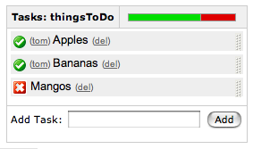
{dynamictasklist:thingsToDo}
|
Показывает динамический список задач. Задачи добавляются к списку и обновляются во время просмотра страницы.
Единственный параметр - название списка задачи. Удостоверьтесь, что Вы не имеете двух списков задач в той же самой странице с тем же самым названием.
Пример:
|
Изображения
Изображения могут быть внедрены в страницы Confluence из приложенных файлов или удаленных источников.
| Примечание |
Комментарий |
!http://www.host.com/image.gif!
или
!attached-image.gif!
|
Вставляет изображение в страницу. Если полностью проверенному URL соответствует изображение, то оно будет отображено из удаленного источника, иначе будет отображаться вложенный файл изображения.
|
!spaceKey:pageTitle^image.gif!
!/2007/05/23/My Blog Post^image.gif!
|
Inserts an image that is attached on another page or blog post. If no space key is defined, the current is space is used by default.
|
| !image.jpg|thumbnail! |
Вставить миниатюры изображений в страницу (работает только с изображениями, которые присоединены к странице). Пользователи могут щелкнуть на миниатюре, чтобы увидеть полноразмерное изображение. Чтобы эта функция работала, администратор сайта должен включить разрешение миниатюр.
|
| !image.gif|align=right, vspace=4! |
Для любого изображения, Вы можете также определить атрибуты признака изображения, как разделенный запятой список имя=значение.
|
{gallery}
{gallery:columns=3}
{gallery:slideshow=false}
{gallery:columns=3|title=Charles' Holiday Photos}
|
Создает галерею миниатюр всех изображений, приложенных к странице. Это , очевидно, будет действовать только на тех страницах на, которые позволяют вложения. параметр Колонки позволяет Вам определять число колонок в галерее (по умолчанию 4) Параметр название позволяет Вам проставить название для галереи Параметр демонстрация слайдов позволяет Вам выключать ссылку "Просмотр как демонстрация слайдов" (по умолчанию включено).
|
Таблицы
Таблицы позволяют Вам организовать содержание в ряды и колонки, и если потребуется с заголовком ряда.
| Примечание |
Комментарий |
||heading 1||heading 2||heading 3||
|col A1|col A2|col A3|
|col B1|col B2|col B3|
|
Делает таблицу. Используйте двойную линию для обозначения заголовков таблицы. Заметим, что каждая строка таблицы должна быть определена на одной линии.
Данный здесь код создает таблицу, которая похожа на:
| heading 1 |
heading 2 |
heading 3 |
| col A1 |
col A2 |
col A3 |
| col B1 |
col B2 |
col B3 |
|
{column:width=50%}
Text in this column.
{column}
|
Определяет одну колонку.
- width: - (дополнительно) ширина колонки.
Должно быть определено в секции макроса.
|
{section}
{column:width=30%}
Column one text goes here
{column}
{column:width=70%}
Column two text goes here
{column}
{section}
{section:border=true}
...
{section}
|
If you want to use columns instead of tables, you can define them first by marking a {section}, and then placing any number of {column}s inside.
- border: - (optional) set to "true" to draw a border around the section and columns.
|
{csv}
, January, February, March, April
Max, 37.5, 32.7, 28.0, 25.3
Min, 31.3, 26.8, 25.1, 18.7
{csv}
{csv:output=wiki|width=900|border=15|delimiter=whitespace}
Month Max Min Average
January 25.5 *6.3* 15.9
February 32.4 12.8 22.6
March 44.6 24.5 34.6
April 59.7 37.1 48.4
May 72.5 48.7 60.6
June 81.3 57.9 69.6
July 85.2 62.8 74
August 82.5 60.7 71.6
September 73.7 51.7 62.7
October 61.1 40.1 50.6
November 43.6 27.4 35.5
December 29.9 13.6 21.8
{csv}
|
Converts csv and other deliminated data into a table.
CSV is not a formal standard, but the best reference is
The Comma Separated Value (CSV) File Format .
The support in this macro comes close to following this pseudo-standard.
For more details see
SCRP-16. This macro shares common table capabilities with other table
based macros (excel, table-plus, and sql). .
The support in this macro comes close to following this pseudo-standard.
For more details see
SCRP-16. This macro shares common table capabilities with other table
based macros (excel, table-plus, and sql).
- output - Determines how the output is formated:
- html - Data is output as a HTML table (default).
- wiki - Data is output as a Confluence wiki table. Use this option if you want data within the table to be formated by the Confluence wiki renderer.
- script - Location of csv data. Default is the macro body only. If a location of data is specified, the included data will follow the body data.
- #filename - Data is read from the file located in confluence home directory/script/filename. Subdirectories can be specified.
- global page template name - Data is read from a global page template.
- space:page template name - Data is read from a space template.
- ^attachment - Data is read from an attachment to the current page.
- page^attachment - Data is read from an attachment to the page name provided.
- space:page^attachment - Data is read from an attachment to the page name provided in the space indicated.
- url - Specifies the URL of an csv file. If a url location is specified, the included data will follow the body and script data.
Use of this parameter may be restricted for security reasons. See your administrator for details.
- heading - Number of rows to be considered heading rows (default is 1 row). Specify heading=false or heading=0 to not show any heading lines.
- border - The border width in pixels. Defaults to normal table border width.
- width - The table width in pixels. Default is 100%.
- delimiter - Delimiter that separates columns. Note that trailing delimiters on a line result in a blank column at the end of the row.
- , or "," (comma) - The default column separator.
- whitespace - Blanks, tabs, and other white space are used to separate columns.
- blanks - Blank or blanks only.
- other single character delimiter - may be within double quotes with some restictions. Examples: ";", "=",
- quote - the character used to represent quoted data. Quoted data may contain delimiters or new lines. Quote character data must be doubled inside a quoted string.
- double - Double quote character (default).
- single - Single quote character.
- escape - When wiki output is requested (output=wiki), some special characters (like '|', '[', ']', '{', '}') in data may cause undesirable formatting of the table.
Set escape=true to allow these special characters to be escaped so that it will not affect the formatting.
The default is false so that data that has wiki markup will be handled correctly.
- showWiki - Default is false. Set to true to show a non-formatted version of the wiki table following the formatted table.
This is used to help resolve formating issues.
|
{table-plus}
|| || January || February || March || April ||
| Max | 37.5 | 32.7 | 28.0 | 25.3 |
| Min | 31.3 | 26.8 | 25.1 | 18.7 |
{table-plus}
{table-plus:width=500|border=15|enhableHighlighting=false|columnTypes=S,F,F,F}
|| Month || Max || Min || Average ||
| January | 25.5 | *6.3* | 15.9 |
| February | 32.4 | 12.8 | 22.6 |
| March | 44.6 | 24.5 | 34.6 |
| April | 59.7 | 37.1 | 48.4 |
Other text can be here too!
|| Another table ||
| more data |
{table-plus}
{table-plus:columnTypes=S,-,.|autoNumber=true|sortColumn=3
|columnAttributes=,,style="background:yellow; font-size:14pt;"}
|| Name || Phone || TCP ||
| John | 555-1234 | 192.168.1.10 |
| Mary | 555-2134 | 192.168.1.12 |
| Bob | 555-4527 | 192.168.1.9 |
{table-plus}
|
Adds column sorting and other attributes to one or more tables found in the body of the macro.
The tables can be produced by wiki markup or other means.
This macro shares common table capabilities with other table
based macros (excel, csv, and sql).
- heading - Number of rows to be considered heading rows (default is 1 row).
Specify heading=false or heading=0 to not show any heading lines.
Heading rows do not participate in sorting.
- footing - Number of rows to be considered footing rows (default is 0).
Footing rows do not participate in sorting. An auto total row is automatically treated as a footing row.
- width - The table width in pixels. Default is 100%.
- border - The border width in pixels. Defaults to normal table border width.
- multiple - Default is true which means all tables found within the macro body are processed.
Set multiple=false to only process the first table found and may need to be used
if the table includes cells that are also tables.
- Other parameters - Other parameters are passed through to the html table markup for more advanced
capabilities or to override the default class
A javascript enabled browser is required to enable these capabilities.
A number of table based macros (table-plus, csv, excel, and sql) share these common capabilities.
- Column sorting - sort a column by clicking on column heading.
Clicking again will reverse the order. Auto sorting before display
- Row highlighting on mouse over - row is highlighted when mouse goes over any row element for non-heading rows
- Column attributes - ability to set the display attributes (color, font) on a column basis
- Auto numbering - ability to automatically add a leading column with the data row count.
- Auto totaling - ability to automatically add a footing row that totals all numeric columns.
Parameters - the following parameters control these common table capabilities:
- enableSorting - Set enableSorting=false to prevent sorting.
- enableHighlighting - As the mouse moves over a table row, the row will be highlighted by default.
Set enableHighlighting=false to stop this behavior.
This parameter was formerly known as highlightRow which still works.
- sortColumn - The table can be auto sorted before it is displayed by any valid column name
or number provided by this parameter. No auto sorting will be done
if this value is not provided or is invalid. A column number is a 1-based count
of columns (excluding auto number column).
- sortDescending - If sortDescending=true, the sort indicated by the sortColumn will
be done in reverse order.
- sortTip - Text that is used to provide user feedback with mouse is over
a column heading that is sortable. Default text is: "Click to sort" followed by
the column name if available.
- sortIcon - Default is false to not show a sort indicator icon.
Set sortIcon=true to include a sort icon in the first heading row for sortable columns.
An icon will show for the last column sorted indicating the direction the column was sorted.
- highlightColor - Color of row when mouse is over a row element.
See Colors for how to specify.
- autoNumber - If autoNumber=true, an additional column will be added that will
count each data row.
- autoTotal - If autoTotal=true, an additional row will be appended to the end of the table
that will contain totals of all numeric columns.
- autoNumberSort - If autoNumberSort=true, the auto number column will be sortable and
will retain the original data row count even after row sorting.
- columnTypes - By default, all columns are treated as strings for sorting purposes unless
a more specific sort type is provided either by the macro logic or
by this parameter. The parameter
is a comma separated list of column type indicators to identify column types.
- S - string
- I - integer
- F - float
- C - currency or similar where it is a float value with pre or post characters
- D - date in the browser date format. More advanced date handling may be available
on your server after installation of a date handling library. See online
docmentation for more information.
- X - exclude this column from user selectable sorting
- . or - or : or / - separated numbers, like phone numbers or TCP addresses.
Valid values are multiple integer numbers separated by one of the separators indicated by the type.
- H - hide the column.
- columnAttributes - A comma separated list of values used to modify cell attributes for all
cells in a column. The position in the comma separated list corresponds
to the column that the values apply to. Each value is a double semi-colon
list of attributeName=value pairs that will be applied to the column cells.
- enableHeadingAttributes - By default, any column attributes provided will be applied to the all column rows including heading rows.
Set enableHeadingAttributes=false to have the column attributes apply only to data rows.
- id - Sets the table id for the table for use in macros (like the chart macro) to identify a
specific table.
|
Расширенное форматирование
Больше о расширенном форматировании текста.
| Примечание |
Комментарий |
{noformat}
предварительно отформатированная часть текста
so *no* further _formatting_ сделана здесь
{noformat}
|
Делает предварительно форматированный блок текста без подсвечивания синтаксиса. Все дополнительные параметры макроса {panel} правильны также и для {noformat}.
- нет панели: , Если значение "нет панели" верно, то выдержка будет оттянута без ее ближайшей панели.
Пример:
|
{panel}Some text{panel}
{panel:title=My Title}Some text with a title{panel}
{panel:title=My Title| borderStyle=dashed| borderColor=#ccc| titleBGColor=#F7D6C1| bgColor=#FFFFCE}
a block of text surrounded with a *panel*
yet _another_ line
{panel}
|
Охватывает блок текста в пределах полностью настраиваемой панели. Дополнительные параметры, которые Вы можете определить, следующие:
- title: Заголовок панели
- borderStyle: Используемый стиль границы этой панели (сплошная, пунктирная линия и другие CSS стили границ)
- borderColor: Цвет используемый для границы этой панели
- borderWidth: Ширина границы этой панели использования
- bgColor: Цвет фона этой панели
- titleBGColor: Цвет фона раздела заголовка этой панели
Example:
My Title
a block of text surrounded with a panel
yet another line
|
{code:title=Bar.java|borderStyle=solid}
// Some comments here
public String getFoo()
{
  return foo;
}
{code}
{code:xml}
<test>
    <another tag="attribute"/>
</test>
{code}
|
Делает предварительно отформатированный блок программы с синтаксическими отступами. Все дополнительные параметры макроса {panel} также действительны и для {code}. Язык по умолчанию - Java , но Вы также можете определить JavaScript , ActionScript , XML , HTML и SQL .
Пример:
public String getFoo()
{
return foo;
}
<test>
<another tag="attribute"/>
</test>
|
|
{index}
|
Отображает индекс всех страниц в текущем пространстве, пересеченное, связанное и отсортированное в алфавитном порядке.
|
|
{content-by-user:fred}
|
Отображает простую таблицу всего содержания (страницы, комментарии, статьи, профили пользователя и описания пространств) созданных пользователем (здесь fred).
|
{chart:title=Fish Sold}
|| Fish Type || 2004 || 2005 ||
|| Herring | 9,500 | 8,300 |
|| Salmon | 2,900 | 4,200 |
|| Tuna | 1,500 | 1,500 |
{chart}
{chart:type=line|title=Temperatures in Brisbane|yLabel=Celcius
|dataDisplay=true|dataOrientation=vertical}
|| Month || Min || Max ||
| January | 31.3 | 37.5 |
| February | 26.8 | 32.7 |
| March | 25.1 | 28 |
| April | 18.7 | 25.3 |
{chart}
{chart:type=timeSeries|dateFormat=MM.yyyy|timePeriod=Month|
dataOrientation=vertical|rangeAxisLowerBound=0|colors=blue,gray}
|| Month || Revenue ||
| 1.2005 | 31.8 |
| 2.2005 | 41.8 |
| 3.2005 | 51.3 |
| 4.2005 | 33.8 |
| 5.2005 | 27.6 |
| 6.2005 | 49.8 |
| 7.2005 | 51.8 |
| 8.2005 | 77.3 |
| 9.2005 | 73.8 |
| 10.2005 | 97.6 |
| 11.2005 | 101.2 |
| 12.2005 | 113.7 |
|| Month || Expenses ||
| 1.2005 | 41.1 |
| 2.2005 | 43.8 |
| 3.2005 | 45.3 |
| 4.2005 | 45.0 |
| 5.2005 | 44.6 |
| 6.2005 | 43.8 |
| 7.2005 | 51.8 |
| 8.2005 | 52.3 |
| 9.2005 | 53.8 |
| 10.2005 | 55.6 |
| 11.2005 | 61.2 |
| 12.2005 | 63.7 |
{chart}
|
Displays a chart using data from the supplied table or tables.
- Chart type parameters - These parameters change what type of chart to display and the way the chart looks.
- Display control parameters
- width - The width of the chart in pixels (default is '300')
- height - The height of the chart in pixels (default is '300')
- dataDisplay - Default is false to not display the rendered body of the macro (usually the data tables).
When dataDisplay=true or dataDisplay=after, the data will be displayed after the chart.
When dataDisplay=before, the data will be displayed before the chart.
- imageFormat - Default is png. Format of generated image. Valid formats are png and jpg. Other formats may be also be valid if installed on your server.
- Title and label customization parameters
- title - The title of the chart.
- subTitle - A subtitle for the chart using a smaller font.
- xLabel - The label to use for the x (domain) axis
- yLabel - The label to use for the y (range) axis
- legend - A legend will be displayed unless 'legend=false' is specified.
- Data specification parameters - The data for the chart is taken from tables found when the macro body is rendered.
These options control how this data is interpreted.
By default, numeric and date values are interpreted according to the Confluence global default language (locale) formats.
If conversion fails, other languages defined to Confluence will be tried.
Additional conversion options can be specified using the parameters below.
- tables - Comma separated list of table ids and/or table numbers
contained within the body of the macro that will be used as the data for the chart.
Defaults to all first level tables.
If data tables are embedded in other tables, then table selection will be required.
This occurs when more complex formatting is done (for example using {section} and {column} macros).
- columns - Comma separated list of column labels and/or column titles and/or column numbers for tables used for chart data.
This applies to all tables processed.
Defaults to all columns.
Columns are enumerated starting at 1. Column label is the text for the column in the header row.
Column title is the (html) title attribute for the column in the header row.
- dataOrientation - The data tables will be interpreted as columns (horizontally) representing domain and x values unless 'dataOrientation=vertical'.
- timeSeries - If 'true', the x values in an XY plot will be treated as time series data and
so will be converted according date formats.
- dateFormat - For time series data, the date format allows for additional customization of the conversion of data to date values.
By default, the Confluence language defined date formats will be used.
If a dateFormat is specified, it will be the first format used to interpret date values.
Specify a format that matches the format of the time series data. See Date Format.
- timePeriod - Specify the time period for time series data. Default is 'Day'. This defines the granularity of how the data is interpreted.
Valid values are: Day, Hour, Millisecond, Minute, Month, Quarter, Second, Week, Year.
- language - If provided, the language and country specification will be used to create additional number and date formats to be
used for data conversion. This specification will be used before the default languages automatically used.
Valid values are 2 character ISO 639-1 alpha-2 codes.
- country - Used in combination with the language parameter.
Valid values are 2 character ISO 3166 codes.
- forgive - Default is true to try to convert numeric and date values that do not totally match any of the default or user specified formats.
Specify forgive=false to enforce strict data format. Data format errors will cause the chart to not be produced.
- Color customization parameters - see Colors for how to specify colors.
- bgColor - Color (default is 'white') to use as the background of the chart.
- borderColor - Color of a border around the chart. Default is to not show a border.
- colors - Comma separated list of colors used to customize category, sections, and series colors.
- Axis customization parameters - Depending on the chart type, the range and domain axis may be customized.
These values are automatically generated based on the data but can be overridden by
specifying one or more more of these paramters.
- rangeAxisLowerBound - range axis lower bound.
- rangeAxisUpperBound - range axis upper bound
- rangeAxisTickUnit - range axis units between axis tick marks
- rangeAxisLabelAngle - angle for the range axis label in degrees
- domainAxisLowerBound - domain axis lower bound.
For a date axis, this value must be expressed in the
date format specified by the dateFormat parameter
- domainAxisUpperBound - domain axis upper bound.
For a date axis, this value must be expressed in the
date format specified by the dateFormat parameter
- domainAxisTickUnit - domain axis units between axis tick marks.
For a date axis, this value represents a count of the
units specified in the timePeriod parameter.
The time period unit can be overridden by specifying a trailing
character: y for years, M for months, d for days, h for hours, m for minutes, s for seconds, u - milliseconds
- domainAxisLabelAngle - angle for the domain axis label in degrees
- categoryLabelPosition - allows axis label text position for categories to be customized
- up45 - 45 degrees going upward
- up90 - 90 degrees going upward
- down45 - 45 degrees going downward
- down90 - 90 degrees going downward
- dateTickMarkPosition - placement of the date tick mark
- start (default) - tick mark is at the start of the date period
- middle - tick mark is in the middle of the date period
- end - tick mark is at the end of the date period
- Pie chart customization parameters
- pieSectionLabel - Format for how pie section labels are displayed.
The default is to show only the pie section key value.
The format is a string with special replacement variables:
- %0% is replaced by the pie section key.
- %1% is replaced by the pie section numeric value.
- %2% is replaced by the pie section percent value.
Example 1: "%0% = %1%" would display something like "Independent = 20"
Example 2: "%0% (%2%)" would display something like "Independent (20%)"
- pieSectionExplode - Comma separated list of pie keys that are to be shown exploded.
Defaults to no exploded sections.
Note: requires jFreeChart version 1.0.3 or higher.
- Attachment parameters - These are advanced options that can be used for chart versioning, automation enablement, and to improve
performance. Use these options carefully! Normally, the chart image is regenerated each time the page is displayed. These options
allow for the generated image to be saved as an attachment and have subsequent access re-use the attachment.
This can be useful especially when combined with the cache macro to improve performance. Depending on the options chosen,
chart images can be versioned for historical purposes.
- attachment - Chart image will be saved in a attachment.
This advanced capability is for automation or use in combination with the cache macro.
For attachment to be used, the user must be authorized to add attachments to the page specified.
- ^attachment - The chart is saved as an attachment to the current page.
- page^attachment - The chart is saved as an attachment to the page name provided.
- space:page^attachment - The chart is saved as an attachment to the page name provided in the space indicated.
- attachmentVersion - Defines the the versioning mechanism for saved charts.
- new - (default) Creates new version of the attachment.
- replace - Replaces all previous versions of the chart.
To replace an existing attachment, the user must be authorized to remove attachments for the page specified.
- keep - Only saves a new attachment if an existing export of the same name does not exist.
An existing attachment will not be changed or updated.
- attachmentComment - Comment used for a saved chart attachment.
- thumbnail - Default is false. If true, the chart image attachment will be shown as a thumbnail.
Colors can be specified by name or hex value. See Web-colors.
The following are the valid color names that will automatically be converted.
| Color |
Hexadecimal |
Color |
Hexadecimal |
Color |
Hexadecimal |
Color |
Hexadecimal |
| black |
#000000 |
silver |
#c0c0c0 |
maroon |
#800000 |
red |
#ff0000 |
| navy |
#000080 |
blue |
#0000ff |
purple |
#800080 |
fuchsia |
#ff00ff |
| green |
#008000 |
lime |
#00ff00 |
olive |
#808000 |
yellow |
#ffff00 |
| teal |
#008080 |
aqua |
#00ffff |
gray |
#808080 |
white |
#ffffff |
Copied from Java SimpleDateFormat specification.
Date and time formats are specified by date and time pattern
strings.
Within date and time pattern strings, unquoted letters from
'A' to 'Z' and from 'a' to
'z' are interpreted as pattern letters representing the
components of a date or time string.
Text can be quoted using single quotes (') to avoid
interpretation.
"''" represents a single quote.
All other characters are not interpreted; they're simply copied into the
output string during formatting or matched against the input string
during parsing.
The following pattern letters are defined (all other characters from
'A' to 'Z' and from 'a' to
'z' are reserved):
Pattern letters are usually repeated, as their number determines the
exact presentation:
- Text:
For formatting, if the number of pattern letters is 4 or more,
the full form is used; otherwise a short or abbreviated form
is used if available.
For parsing, both forms are accepted, independent of the number
of pattern letters.
- Number:
For formatting, the number of pattern letters is the minimum
number of digits, and shorter numbers are zero-padded to this amount.
For parsing, the number of pattern letters is ignored unless
it's needed to separate two adjacent fields.
- Year:
For formatting, if the number of pattern letters is 2, the year
is truncated to 2 digits; otherwise it is interpreted as a
number.
For parsing, if the number of pattern letters is more than 2,
the year is interpreted literally, regardless of the number of
digits. So using the pattern "MM/dd/yyyy", "01/11/12" parses to
Jan 11, 12 A.D.
For parsing with the abbreviated year pattern ("y" or "yy"),
SimpleDateFormat must interpret the abbreviated year
relative to some century. It does this by adjusting dates to be
within 80 years before and 20 years after the time the SimpleDateFormat
instance is created. For example, using a pattern of "MM/dd/yy" and a
SimpleDateFormat instance created on Jan 1, 1997, the string
"01/11/12" would be interpreted as Jan 11, 2012 while the string "05/04/64"
would be interpreted as May 4, 1964.
During parsing, only strings consisting of exactly two digits, will be parsed into the default century.
Any other numeric string, such as a one digit string, a three or more digit
string, or a two digit string that isn't all digits (for example, "-1"), is
interpreted literally. So "01/02/3" or "01/02/003" are parsed, using the
same pattern, as Jan 2, 3 AD. Likewise, "01/02/-3" is parsed as Jan 2, 4 BC.
- Month:
If the number of pattern letters is 3 or more, the month is
interpreted as text; otherwise,
it is interpreted as a number.
- General time zone:
Time zones are interpreted as text if they have
names. For time zones representing a GMT offset value, the
following syntax is used:
     GMTOffsetTimeZone:
             GMT Sign Hours : Minutes

     Sign: one of
             + -
     Hours:
             Digit
             Digit Digit

     Minutes:
             Digit Digit
     Digit: one of
             0 1 2 3 4 5 6 7 8 9
Hours must be between 0 and 23, and Minutes must be between
00 and 59. The format is locale independent and digits must be taken
from the Basic Latin block of the Unicode standard.
For parsing, RFC 822 time zones are also
accepted.
- RFC 822 time zone:
For formatting, the RFC 822 4-digit time zone format is used:
     RFC822TimeZone:
             Sign TwoDigitHours Minutes
     TwoDigitHours:
             Digit Digit
TwoDigitHours must be between 00 and 23. Other definitions
are as for general time zones.
For parsing, general time zones are also
accepted.
|
{note:title=Be Careful}
The body of the note here..
{note}
|
Prints a simple note to the user.
- title: - (optional) the title of the note.
- icon: - (optional) if "false", dont display the icon.
|
{warning:title=Warning}
Insert warning message here!
{warning}
|
Prints a warning note to the user.
- title: - (optional) the title of the warning.
- icon: - (optional) if "false", dont display the icon.
|
{info:title=Useful Information}
This macro is useful for including helpful information in your confluence pages
{info}
|
Prints an informational note.
- title: - (optional) the title of the information box.
- icon: - (optional) if "false", dont display the icon.
|
{tip:title=Handy Hint}
Join the Confluence Mailing-List!
{tip}
|
Prints a helpful tip for the user.
- title: - (optional) the title of the tip.
- icon: - (optional) if "false", dont display the icon.
|
Содержание Confluence
Способы включать, чтобы резюмировать или обратиться к другому содержанию Confluence.
| Примечание |
Комментарий |
{excerpt}Confluence - это приложение доступной базы знаний, которой позволяет командам общаться более эффективно{excerpt}
{excerpt:hidden=true}Эта выдержка будет зарегистрирована, но не будет показана на странице.{excerpt}
|
Отметьте некоторую часть страницы как выборка страницы. Это не изменяет отображение страницы вообще, но другие макросы (например подчиненные, включать выборку, и блог посты) могут использовать эту выборку, чтобы резюмировать содержание страницы.
- скрытый:, Если значение "hidden" истинно, то содержание макроса выборки не будет появляться на странице.
|
{include:Home}
{include:FOO:Home}
{include:spaceKey=FOO|pageTitle=Home}
|
Включает одну страницу в пределах другой (этот пример включает страницу, названную "Домашней страницей"). Страницы из другого пространства могут быть включены, предваряя заголовок страницы с ключом "пространства" и двоеточием.
Пользователь, просматривающий страницу должен иметь включенные права для просмотра страницы, или она не будет отображена.
|
{excerpt-include:Home}
{excerpt-include:Home|nopanel=true}
{excerpt-include:blogPost=/2006/12/28/News Page}
|
Включает выборку от одной страницы (см. макрос выборки) в пределах другой. Включенная страница должна быть в том же самом пространстве что и страница, на которой используется макрос.
- без панели:Если значение "без панели" является истинным, то выборка будет отображена без окружающей ее панели.
|
{search:query=my_query}
{search:query=my_query|maxLimit=x}
|
Делает внутренний поиск сайта.
- query: ваш запрос
- maxLimit=x: (где x - любое число> 0) ограничить результат поиска множеством результатов.
- spacekey: определите ключ пространства, в котором Вы хотите искать
- type: определите тип содержания (может быть страница, комментарий, блогпост, вложение, информация пользователя, описание пространства)
- lastModified: определите период времени, в котором содержание было последний раз изменено: (например 3d = измененное за прошедшие 3 дня, 1m3d = измененное за прошедший месяц и три дня)
Пример:
Найден 2 результат (ы) для home
|
{children}
{children:all=true}
{children:depth=x}
{children:depth=x|style=h3}
{children:excerpt=true}
{children:page=Another Page}
{children:page=/}
{children:page=SPACEKEY:}
{children:page=SPACEKEY:Page Title}
{children:first=x}
{children:sort=<mode>|reverse=<true or false>}
|
Отображает подчиненных и потомков текущей страницы. Определите all=true, чтобы показать всех потомков этой страницы или depth=x (где x - любое число> 0) чтобы показывать несколько уровней подчинения. Атрибут style может быть любой от h1 до h6. Если Вы определите стиль, то верхний уровень подчиненных страниц будет отображен как заголовок этого уровня, с подчиненными ему, отображенными ниже. Лучший способ сформировать краткую страницу содержания! Вы можете просмотреть подчиненных различной страницы в том же самом пространстве с {children:page=Another Page Title}. Если Вы определяете страницу через /, Вы перечисляете все страницы в пространстве без родителя (то есть страницы верхнего уровня), исключая текущую страницу Если Вы определите страницу FOO: (двоеточие требуется), Вы перечислите все страницы без родителя в пространстве с ключом "FOO". Определите excerpt=true, чтобы также отобразить первую линию выборки страницы (см. макрос выборки), если она существует.
Пример:
- подчиненная
- другая подчиненная
- подчиненная
- другая подчиненная
Атрибут сортировать - дополнительный признак, который позволяет Вам конфигурировать, как отсортированы подчиненные. Определите создание для сортировки по дате создания, заголовок для сортировке в алфавитном порядке на заголовке и изменен для сортировке по дате последней модификации. Используйте обратный атрибут, чтобы произвольно полностью изменить сортировку. Атрибут первые позволяет Вам ограничивать число подчиненных, отображенных в верхнем уровне.
|
{blog-posts:5}
{blog-posts:5|content=excerpts}
{blog-posts:5|content=titles}
{blog-posts:time=7d|spaces=@all}
{blog-posts:15|time=14d|content=excerpts}
{blog-posts:labels=confluence,atlassian}
{blog-posts:labels=atlassian,confluence,content|match-labels=all}
|
Показывает новые сообщения в этом пространстве
Первый параметр количеством отображаемых новостных сообщений (по умолчанию: 15)
Параметр содержание позволяет Вам выбирать, показывать ли каждое введенное сообщение полностью (по умолчанию), только короткие выдержки из каждого сообщения (см. макро-выдержку), или только список названий сообщений.
Параметр время позволяет Вам выбирать, как далеко назад искать новостные сообщения. Например, "time=12h" показал бы Вам сообщения, сделанные за прошедшие двенадцать часов, а "time=7d" покажет сообщения, сделанные на прошлой неделе. (По умолчанию нет ограничения)
Параметры меток позволяют Вам определять список меток, которые будут использоваться, чтобы фильтровать блог постов, которые возвращены. По умолчанию, блог посты, которые соответствуют любому из указанных меток, возвращены. Чтобы возвращать блог посты, которые соответствуют всем указанным меткам, добавьте match-labels=all как параметр.
Параметры меток позволяют Вам определять список пространств, из которых будут приходить сообщения. По умолчанию, используется текущее пространство. Если указано spaces=@all, то буду использоваться все пространства.
|
!quicktime.mov!
!spaceKey:pageTitle^attachment.mov!
!quicktime.mov|width=300,height=400!
!media.wmv|id=media!
|
Внедряет объект в страницу, берущийся в отделенном запятыми свойствах.
Форматы поддерживаемые по умолчанию:- Flash (.swf)
- Quicktime movies (.mov)
- Windows Media (.wma, .wmv)
- Real Media (.rm, .ram)
- MP3 files (.mp3)
Другие типы файлов могут использоваться, но могут требовать спецификации "classid", "codebase" и "pluginspage" свойств, чтобы быть признанными web-браузерами.
Общие свойства:
- width - ширина медиафайла
- height - высота медиафайла
- id - ID назначенный на вложенный объект
Из-за проблем безопасности, не разрешаются файлы, расположенные на отдаленных серверах
Моделирование
По умолчанию каждый внедренный объект заключается в тэг "div". Если вы хотите модернизировать div и его содержание перепишите CSS класс "embeddedObject". определение ID как свойства также позволит по разному модернизировать различные внедренные объекты. CSS класс используется называемым в формате "embeddedObject-ID".
|
{userlister}
{userlister:groups=confluence-administrators}
{userlister:online=true}
{userlister:groups=confluence-users|online=true}
|
Список пользователей, зарегистрированных в Confluence По умолчанию перечислит каждого пользователя в системе (не рекомендуется для установки с большим количеством пользователей). Установка значения групп перечислит только членов тех групп. Значение групп поддерживает разделенный запятой список имен групп.
Определение значения онлайн позволяет Вам ограничить список пользователей только находящимися в состоянии онлайн. Установка online=true покажет только онлайн пользователей, тогда как установка online=false покажет только офлайн пользователей.
|
{usage:spaces=@all}
{usage:spaces=dog,cat|types=page,blogpost}
{usage:period=hourly|timespan=1d|events=create,view,update}
|
A macro to show usage statistics.
- spaces: - (optional) a comma-separated list of spaces to restrict content to. By default the current space will be used.
- types: - (optional) a comma-separated list of content types to restrict content to (page content by default).
- events: - (optional) a comma-separated list of events to restrict content usage based on certain events (view events by default). Allowed events values are 'view', 'create', 'remove' and 'update'.
- columns: - (optional) the type of column to display (event by default). Allowed column values are 'event', 'space' and 'type'.
- timespan: - (optional) restrict the timespan of popularilty from today minus the given value. The timespan value should be a number followed by one of the following: 'w' for week, 'd' for day and 'm' for month. 1d (1 day) is used by default.
- period: - (optional) the periodic interval to display (daily by default). Allowed period values are 'daily','weekly', 'monthly', 'yearly', 'hourly' and 'minutely'.
|
{popular:spaces=@all}
{popular:spaces=dog,cat|types=page,blogpost}
{popular:timespan=1m|events=create,view,update|max=20}
|
A macro to show popular content.
- spaces: - (optional) a comma-separated list of spaces to restrict content to. By default the current space will be used.
- types: - (optional) a comma-separated list of content types to restrict content to (page content by default).
- labels: - (optional) a comma-separated list of labels to restrict content to.
- display: - (optional) a comma-separated list of items to display (title, count by default). Allowed values are 'icon', 'title', 'count'.
- timespan: - (optional) restrict the timespan of usage from today minus the given value. The timespan value should be a number followed by one of the following: 'w' for week, 'd' for day and 'm' for month. 1w (1 week) is used by default.
- events: - (optional) a comma-separated list of events to restrict content popularity based on certain events (view events by default). Allowed events values are 'view', 'create', 'remove' and 'update'.
- max: - (optional) the maximum number of popular content to display (10 by default).
- style: - (optional) the style to display the popular content in (table by default). Allowed style values are 'list', 'table' and 'flat'.
|
{topusers:spaces=@all}
{topusers:spaces=dog,cat|types=page,blogpost}
{topusers:timespan=1w|period=daily|events=create,view,update|display=icon,title,count}
|
A macro to show active users.
- spaces: - (optional) a comma-separated list of spaces to restrict content to. By default the current space will be used.
- display: - (optional) a comma-separated list of items to display (title, count by default). Allowed values are 'icon', 'title', 'count'.
- types: - (optional) a comma-separated list of content types to restrict content to (page content by default).
- events: - (optional) a comma-separated list of events to restrict top users based on certain events (view events by default). Allowed events values are 'view', 'create', 'remove' and 'update'.
- columns: - (optional) the type of column to display (event by default). Allowed column values are 'event', 'space' and 'type'.
- timespan: - (optional) restrict the timespan of usage from today minus the given value. The timespan value should be a number followed by one of the following: 'w' for week, 'd' for day and 'm' for month. 1w (1 week) is used by default.
- period: - (optional) the periodic interval to display (daily by default). Allowed period values are 'daily','weekly', 'monthly', 'yearly', 'hourly' and 'minutely'.
|
{toc:style=disc|indent=20px}
{toc:outline=true|indent=0px|minLevel=2}
{toc:type=flat|separator=pipe|maxLevel=3}
|
Creates a Table of Contents for headings on the the current page.
- type - (optional) The type of output. May be one of the following:
- list - (default) The headings are output in hierarchical list format.
- flat - The headings are listed on a single line with a separator between them.
- class - (optional) If specified, the TOC will be output with the specified CSS class.
Also, if set, no other style values will be output.
- style - (optional) The style of the list items if in list mode. The style may be any of the following:
- none - (default) Headings are output in indented lists with no bullet points or numbers prefixing them.
- any CSS style - Headings are output in indented lists with the specified CSS style.
- outline - (optional) If set to 'true', each item will be prefixed with a number in the format 'X.Y'.
The numbers will increase automatically, and extra levels will be added for lower-level headings.
- indent - (optional) The amount to indent each list sub-heading by (default is '10px').
- separator - (optional) The type of separator to use if the style is 'flat'. May be one of the following:
- bracket - Square brackets ('[', ']') surrounding each item. (default)
- brace - Braces ('{', '}') surrounding each item.
- comma - A comma (',') between each item.
- paren - Parentheses ('(', ')') surrounding each item.
- pipe - A pipe ('|') between each item.
- newline - A line break after each item.
- "custom" - Any other character you wish, specified between quotes.
- minLevel - (optional) The lowest heading level to include (inclusive). (default is 1).
- maxLevel - (optional) The highest heading level to include (inclusive). (default is 7).
- includePages - (optional) If 'true', any included Confluence pages will be imported and listed.
- include - (optional) If set, any headings not matching the regular expression will be ignored.
Due to '|' being the parameter separator in macros, use ',' where you would have usually used '|'.
- exclude - (optional) If set, any headings matching the regular expression will be excluded.
Due to '|' being the parameter separator in macros, use ',' where you would have usually used '|'.
- printable - (optional) If set to 'false', the table of contents will not be visible when being printed.
|
{toc-zone:separator=brackets|location=top}
h1. First Heading
blah blah blah...
{toc-zone}
|
Creates a Table of Contents for headings contained in the macro body.
- location - (optional) The location to have the table of contents output. May be 'top' or 'bottom'.
If not set, it will be output at both locations.
- type - (optional) The type of output. May be one of the following:
- list - (default) The headings are output in hierarchical list format.
- flat - The headings are listed on a single line with a separator between them.
- class - (optional) If specified, the TOC will be output with the specified CSS class.
Also, if set, no other style values will be output.
- style - (optional) The style of the list items if in list mode. The style may be any of the following:
- none - (default) Headings are output in indented lists with no bullet points or numbers prefixing them.
- any CSS style - Headings are output in indented lists with the specified CSS style.
- outline - (optional) If set to 'true', each item will be prefixed with a number in the format 'X.Y'.
The numbers will increase automatically, and extra levels will be added for lower-level headings.
- indent: - (optional) The amount to indent each list sub-heading by (default is '10px').
- separator - (optional) The type of separator to use if the style is 'flat'. May be one of the following:
- bracket - Square brackets ('[', ']') surrounding each item. (default)
- brace - Braces ('{', '}') surrounding each item.
- comma - A comma (',') between each item.
- paren - Parentheses ('(', ')') surrounding each item.
- pipe - A pipe ('|') between each item.
- newline - A line break after each item.
- "custom" - Any other character you wish, specified between quotes.
- minLevel: - (optional) The lowest heading level to include (inclusive). (default is 1).
- maxLevel: - (optional) The highest heading level to include (inclusive). (default is 7).
- includePages: - (optional) If 'true', any included Confluence pages will be imported and listed.
- include - (optional) If set, any headings not matching the regular expression will be ignored.
Due to '|' being the parameter separator in macros, use ',' where you would have usually used '|'.
- exclude - (optional) If set, any headings matching the regular expression will be excluded.
Due to '|' being the parameter separator in macros, use ',' where you would have usually used '|'.
- printable - (optional) If set to 'false', the table of contents will not be visible when being printed.
|
|
{contributors-summary:order=edits|limit=3|showAnonymous=true}
{contributors-summary:columns=edits|order=editTime}
|
Creates a table of contributor information from the current page or a group of pages.
Table Options
- groupby - (optional) Specify if the table should be grouped
by contributors or pages. Default value is contributors
- columns - (optional) Specify the columns that should appear in the table as a comma separated list.
Default value is edits,comments,labels. Valid values:
- edits Edit Count Column
- edited List of pages or contributors
- comments Comment Count Column
- commented List of pages or contributors
- labels Label Count Column
- labeled List of pages or contributors
- labellist List of labels
- watches Watch Count Column
- watching List of pages or contributors
- lastupdate Last time a page was updated or a contributor changed some content.
- order - (optional) The order the contributors or pages will appear in.
By default the table is ordered by the number of edits.
- edits Orders the list with the highest
number of edits first in the list
- name Orders the list by name alphabetically
- editTime Orders the list by the time they last edit time
- update Order by the last update time of any content
- reverse - (optional) If true the sort order will be
reversed.
- limit - (optional) Limit the number of contributors displayed to this amount
- showAnonymous - (optional) Show edits by anonymous users. Default is false.
Page Searching Options
The following parameters control what pages are used to build the contributors list.
- page The page to count statistics from.
If no spaces or labels are specified this will default to the current page.
- labels The label to use to search for pages. Multiple labels can be specified in a comma separated list. (A page will match if it has any of the labels.)
- spaces Specifiy the space for the page or labels parameter.
Multiple spaces can be specified in a comma separated list.
If no pages or labels are specified all pages from the space will be included. The following
shortcut labels can also be used:
- @all All Spaces
- @global All Global Spaces
- @personal All Personal Spaces
- contentType Valid options are:
If not specified blog posts and pages are included.
- publishDate specify the publish date for a blog post.
The date format expected is: YYYY/mm/dd
- scope For each of the pages found this parameter lets you include the children or decendants.
(Each page will only be counted once if it is already in the list.)
- children include statistics from the immediate children of the page
- descendants include statiscs from all decendants of the page
|
|
{contributors:order=edits}
{contributors:include=authors,labels|mode=list|showCount=true}
{contributors:order=editTime|limit=6}
|
Creates a list of contributors who have contributed to a page or a list of pages.
Display Options
- include - (optional) What type of content from the
pages to base the contributor list (and the counts) on.
Multiple values can be specified with a comma separated list.
- authors Include page authors (default).
- comments Include page comments
- labels Include page labels
- watches Include page watches
- order - (optional) The order the contributors will appear in.
- count Order by the total count (default)
- name Order by the names of the contributors
- update Order by the last update time
Both the count and update orderings will use values from only the
content specified with the include parameter.
- reverse - (optional) If true the sort order will be
reversed.
- limit - (optional) Limit the number of contributors
initially displayed to this amount
- mode - (optional) Sets the display mode of the macro
- inline The contributors will be displayed across
the screen (default)
- list The contributors will be displayed in a list
down the screen
- showAnonymous - (optional) Show edits by anonymous
users. Default is false.
- showCount - (optional) Show the count for each user.
Default is false.
- showLastTime - (optional) Show the last time a contribution
was made by each user for any content specified by the include parameter.
Default is false.
Page Searching Options
The following parameters control what pages are used to build the contributors list.
- page The page to count statistics from.
If no spaces or labels are specified this will default to the current page.
- labels The label to use to search for pages. Multiple labels can be specified in a comma separated list. (A page will match if it has any of the labels.)
- spaces Specifiy the space for the page or labels parameter.
Multiple spaces can be specified in a comma separated list.
If no pages or labels are specified all pages from the space will be included. The following
shortcut labels can also be used:
- @all All Spaces
- @global All Global Spaces
- @personal All Personal Spaces
- contentType Valid options are:
If not specified blog posts and pages are included.
- publishDate specify the publish date for a blog post.
The date format expected is: YYYY/mm/dd
- scope For each of the pages found this parameter lets you include the children or decendants.
(Each page will only be counted once if it is already in the list.)
- children include statistics from the immediate children of the page
- descendants include statiscs from all decendants of the page
Advanced Options
- showPages - show a list of pages returned above the list. Useful for debugging.
- noneFoundMessage - override the default message that is displayed when no
contributors are found.
|
|
{attachments:patterns=.*doc|old=true}
|
Печать списка вложений
- patterns: - (дополнительно) разделенный запятыми список регулярных выражений. Отображены только соответствующие одному из них имена файлов.
- old: - (дополнительно) если "истинно", также отображаются старые версии вложений.
- upload: - (дополнительно) если "истинно", загружает новые вложения.
|
{spaces:width=x}
|
Отображает список всех пространств, видимых пользователю, со связанными значками, приводящими к различным функциональным пространственному содержанию, в пределах таблицы. Параметр ширины определяет положение таблицы на странице.
-
width - (дополнительно) ширина таблицы в странице Confluence, по умолчанию 100%.
|
{recently-updated}
{recently-updated: spaces=sales,marketing | labels=timesheets,summaries}
|
Включает список, содержание Confluence которого изменилось недавно. Содержание будет перечислено для текущего пространства или для каждого пространства, определенного списке пространств, разделенных запятой (пространство = x, y). Список будет предоставлен в табличном виде с шириной, соответствующей аргументу ширины (width=z) или по умолчанию 99 %
- spaces - (дополнительно) разделенный запятыми список ключей пространства
- labels - (дополнительно) разделенный запятыми список меток (будет перечислено содержание, связанное с по крайней мере с одной из них)
- width - (дополнительно) ширина таблицы в странице Confluence, по умолчанию 100%.
|
{global-reports: width=x}
|
Отдает список ссылок к глобальным отчетам в пределах таблицы шириной x (значения по умолчанию 99 %).
-
width - (дополнительно) ширина таблицы на странице Confluence по умолчанию 50%.
|
{welcome-message}
|
Включает приглашение сайта Confluence. Приглашение сайта может конфигурироваться в Администрировании-> раздел Общая конфигурация. |
{create-space-button: size=large | width=32 | height=32}
|
Воспроизводит создание кнопки пространства связанной с отрываемой страницей пространства.
-
size - маленький (маленький размер, используемый для маленькой графики, тогда как большой размер используется для большой)
-
height - высота изображения в пикселях
-
width - ширина изображения в пикселях
|
{livesearch:id=1|spaceKey=KEY}
|
Show search results keystroke by keystroke.
- id: - (optional) to uniquely identify the livesearch when there are multiple livesearch macros in one page
- spaceKey: - (optional) this option searches within a single space.
|
{popular-labels}
{popular-labels:style=heatmap|count=15}
|
Отображает список (или 'heatmap') из наиболее популярных ярлыков отсортированных по популярноси (или имени).
-
count - (дополнительно) Определяет количество отображаемых ярлыков, по умолчанию 100.
-
spaceKey - (дополнительно) Ограничивает популярные ярлыки определенным пространством.
-
style - (дополнительно) Разрешает 'heatmap'. При использовании этого стиля ярлыков будут отображаться с различными размерами шрифтов в зависимости от их популярности, и будут отсортированы по названию. Если не используется, то будет использоваться стиль по умолчанию, отображающий ярлыки отсортированные по популярности (наиболее популярные сверху).
|
{contentbylabel:dogs,cats}
{contentbylabel:dogs,cats|key=PETS}
{contentbylabel:dogs,cats|type=page,blogpost}
{contentbylabel:dogs,cats|showLabels=false|showSpace=false}
{contentbylabel:dogs,cats|excerpt=true}
{contentbylabel:dogs,cats|operator=AND}
|
Отображает список содержания маркированного указанными ссылками.
-
key - (дополнительно) ограничить содержание определенным пространством.
-
type - (дополнительно) ограничивают содержание определенным типом (все включено по умолчанию)
-
showLabels - (дополнительно) показывать метки для каждого результата (по умолчанию включено)
-
showSpace - (дополнительно) отображать имя пространства для каждого результата (включено по умолчанию)
-
title - (дополнительно) добавить заголовок выше списка результатов
-
maxResults - (дополнительно) максимальное число результатов для отображения (по умолчанию - 5),
-
excerpt - (optional) display first line of excerpt for each result
-
operator - (optional) show content matching with OR:any labels, AND:all labels (OR by default)
|
{related-labels}
{related-labels:labels=labelone, labeltwo}
|
Делает список меток связанным с метками текущей страницы.
-
labels - (дополнительной) разделенный запятой список меток, связанные метки которых будут показаны.
|
{recently-used-labels}
{recently-used-labels:scope=space|count=15}
|
Отдает список (или таблицу) меток, последний раз используемых в указанных возможностях.
-
count - (дополнительно) Определяет число меток, которые будут показаны. Если не определено, по умолчанию используется 10.
-
scope - (дополнительно) Позволяет глобальный, пространственный и личный. Если не определено, используются глобальные возможности . Глобальные возможности покажут метки, которые недавно использовались в пределах этой инсталляции Confluence. Пространственные возможности покажут метки, которые недавно использовались в текущем пространстве. Личные возможности покажут Вам личные метки, которые Вы недавно использовали.
-
style - (дополнительно) Определяет таблицу. Определение стиля таблицы вывода последний раз используемых меток в форме таблицы.
-
title - (дополнительно) Позволяет вам определить заголовки для просмотра таблицы этого макроса. См. опцию style выше.
|
{navmap:mylabel}
{navmap:mylabel|wrapAfter=3|cellWidth=110|cellHeight=20|theme=mytheme}
|
Делает список страниц, связанных с указанной меткой, в виде карты навигации.
Для этого макроса должна быть определена метка. Следующие параметры являются все дополнительными:
- title - заголовок для этой карты навигации
- wrapAfter - число ячеек для объединения по горизонтали перед переходом на следующую строку. (по умолчанию: 5)
- cellWidth - ширина индивидуальных ячеек в карте в пикселях. (по умолчанию: 90px)
- cellHeight - высота индивидуальных ячеек в карте в пикселях. (по умолчанию: 60px)
- theme - если Вы хотите создать ваш собственный вид карты навигации (скажем круглыми углами), Вы можете сделать это, добавив файл в каталог WEB-INF/classes/templates/macros . Имя файла должно быть: navmap-mytheme.vm. Вместо mytheme Вы можете использовать любое имя. Только удостоверьтесь, что макрос его использует theme=mytheme.
|
{listlabels:spaceKey=@all}
|
Создает список всех меток, или меток для определенного пространства отсортированных по алфавиту.
-
spaceKey - (optional) list the labels in the specified space (current space by default). If '@all' is specified, labels in all spaces will be listed.
|
A-Z
documentation, staff, events, books, music
|
|
Внешнее содержание
Способы включить итоги или ссылки в содержание от других серверов.
| Примечание |
Комментарий |
{rss:url=http://host.com/rss.xml}
{rss:url=http://host.com/rss.xml|max=5}
{rss:url=http://host.com/rss.xml|showTitlesOnly=true}
|
Отображать содержание удаленной RSS доставки в пределах страницы. Заметим: доставка кэшируется в течение 60 минут прежде, чем быть восстановленной снова.
Параметр max может использоваться, чтобы ограничить число показанных записей.
Example:
Вы можете определить showTitlesOnly=true, чтобы показать только заголовки RSS доставки. Этот параметр по умолчанию ложь (false).
Вы можете определить titleBar=false, чтобы скрыть доставку заголовка. Этот параметр по истина (true) .
|
{jiraissues:url=http://jira.rss.url}
{jiraissues:url=http://jira.rss.url|
columns=type;key;summary}
{jiraissues:url=http://jira.rss.url|
count=true}
{jiraissues:url=http://jira.rss.url|
cache=off}
{jiraissues:url=http://jira.rss.url?
os_username=johnsmith&os_password=secret}
|
Импорт и отображение RSS списка проблем JIRA как действующее содержание для страницы. Вы можете легко настроить список и порядок отображаемых столбцов, определяя параметр столбцы.
Не определяя columns выведет в список колонки по умолчанию и отсортирует.
Доступные колонки: ключ, резюме, печать, создан, обновлен, доступность, отчет, приоритет, статус, решение.
Определение count=true заставит макрос только распечатывать, сколько проблем было в списке, не печатая список.
Использование count=true заставит макрос только распечатывать, сколько проблем было в списке, не печатая список.
Использование cache=off вынудит макрос обновлять кэш проблем JIRA.
Примечание: Для работы некоторых фильтров надо залогиниться. Следовательно Поэтому вам, возможно, придется добавить:
&os_username=yourJiraUsername&os_password=yourJiraPassword
в конец URL JIRA с описанием проблемы.
Пример:
|
|
{jiraportlet:url=http://jira.portlet.url}
|
Импортировать и отобразить портлетJIRA 3 на странице Confluence.
Вы можете получить URL для портлета, конфигурируя портлет на вашем рабочем столе JIRA. В то время как в режиме конфигурации, Вы можете скопировать URL портлета из верхней части его отображения.
Примечание: Определенные фильтры, чтобы работать, могут потребовать вошедшего пользователя. Следовательно Вы, возможно, должны добавить:
&os_username=yourJiraUsername&os_password=yourJiraPassword
к концу url портлета.
|
{junitreport:directory=file:///c:/test-reports}
(в настоящее время только собирает файлы результата в формате XML. Установите и отформатируйте в "XML")
{junitreport:url=file:///test-reports/TestRep.xml}
|
Отображает результаты серий (или единичных) тестов JUnit.
| Рейтинг успешности |
Тесты |
Отказы |
Время |
Время |
| 93% |
|
14 |
1 |
0 |
1.531 |
|
{im:myscreenname|service=AIM}
{im:me@hotmail.com|service=MSN|showid=false}
|
Displays a graphic indication of whether an IM user is online. You must supply a valid user ID as the default argument and the desired service.
Parameters
- (default) - The user id/screen name.
- service - The name of the service to check. May be 'aim', 'gtalk', 'icq', 'msn', 'sametime', 'skype', 'wildfire' or 'yahoo'.
- showId - (optional) If 'false', the user's id will not be shown.
|
{sql-query:dataSource=TestDS|output=wiki}
select * from test
{sql}
|
Displays a result table or values from an SQL select statement.
The statement must produce a single result set. Use the sql macro for more complex select or other
statements. The sql-query macro is recommended for better performance.
This macro supports the same parameters as the sql macro, the primary difference is to restrict
what statements can be run.
This macro may have restricted use for security reasons. See your administrator for details.
|
Разное
|
|
")